Redesigning a key ecommerce flow to reduce friction and increase try-ons
Xedo One Page Try-On Journey
Xedo.com is the US-facing tuxedo rental site for ACS Group. As part of the online journey, customers have the option to order a Home Try-On before committing to a full rental — a model that had already proven highly effective in the UK, with strong conversion from try-on to full order.
In early 2016, an external agency was brought in to design a one-page try-on experience. But conversion rates were poor, and user feedback pointed to confusion, frustration, and unclear next steps. I was tasked with redesigning the journey to address these issues and deliver a version that was simpler, more intuitive, and more effective.
- Checkout Redesign
- Accessibility Improvements
- UX Research
- Journey Mapping
- Interaction Design
My role: Lead designer, working across UX, UI, testing and delivery
I led the redesign effort, working closely with the Front-End team, Product Owner, and our optimisation specialist. Due to tight timelines and platform limitations, we focused on what could be achieved through front-end changes alone, with minimal back-end development support.
Access to users was limited, so we relied on a combination of Hotjar session recordings, customer care feedback, and an on-site feedback tool. I also led internal walkthroughs and used InVision’s testing tools — as well as informal testing with friends and family — to compare the original design with proposed improvements.

Redesigning for simplicity, clarity and improved flow
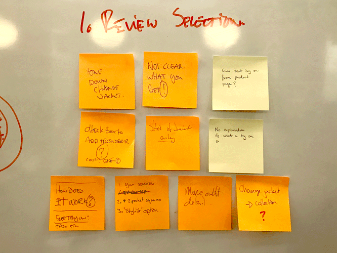
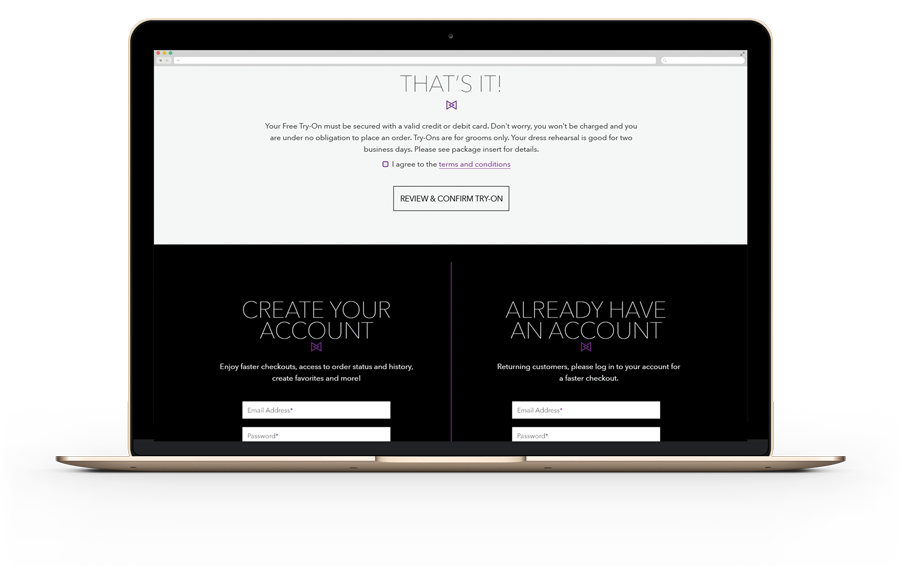
We began by identifying key pain points, particularly in the sizing, data entry and account creation stages. In the original journey, account setup was placed after the final CTA, often causing users to think they’d completed their order when they hadn’t.
To resolve this, I introduced a closed checkout model to keep users focused, and simplified the overall layout:
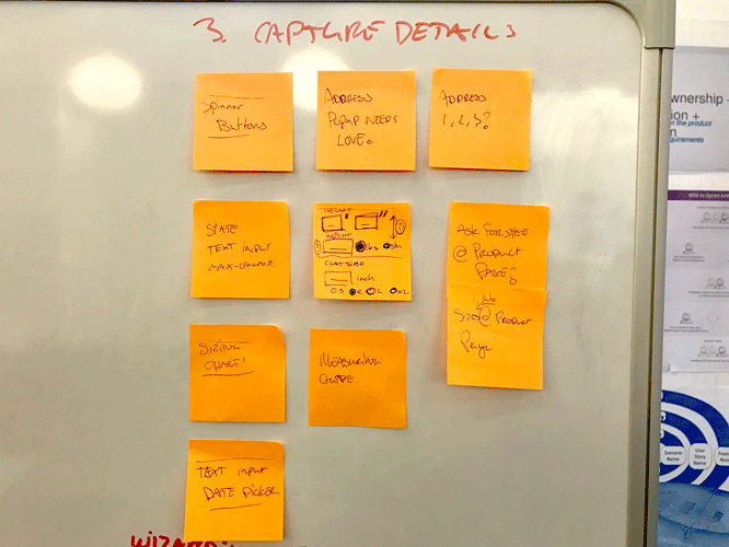
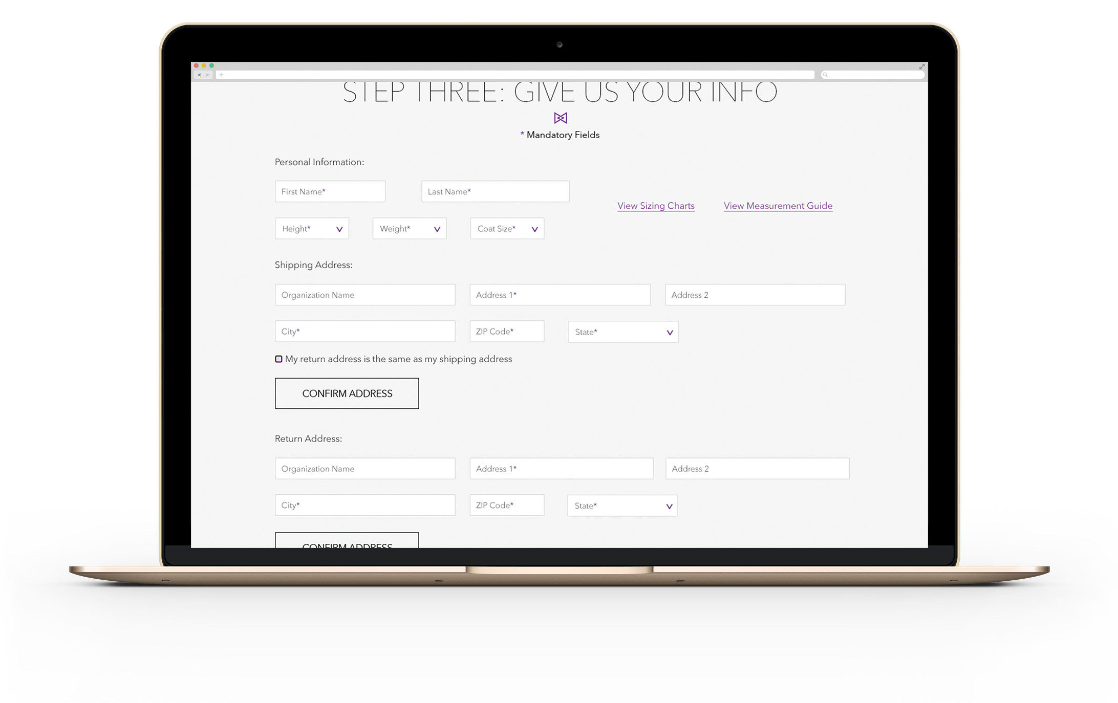
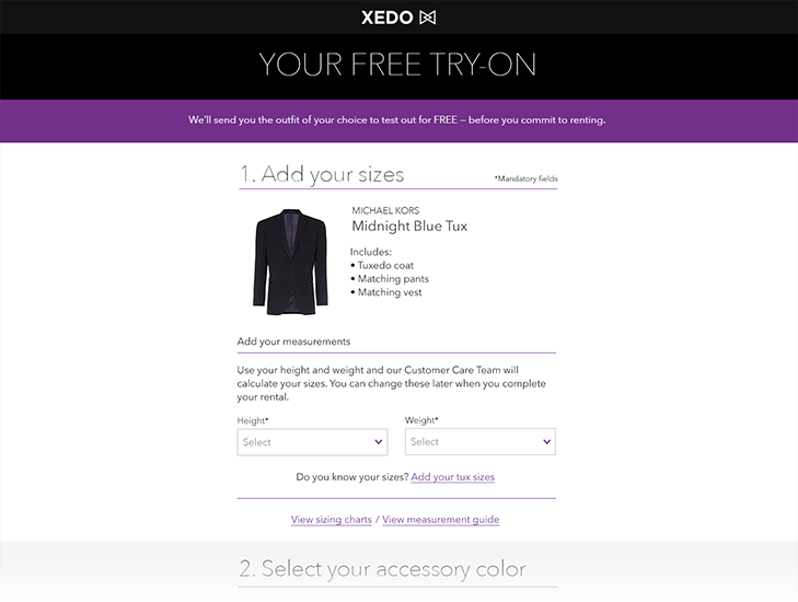
Measurement entry was moved to the top of the page, in line with customer expectations.
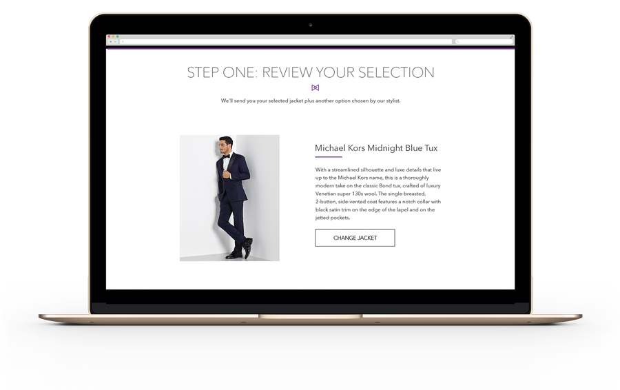
The header was streamlined and the product description replaced with a concise list of try-on items.
Video guidance was removed in favour of clearer measurement charts and guides.
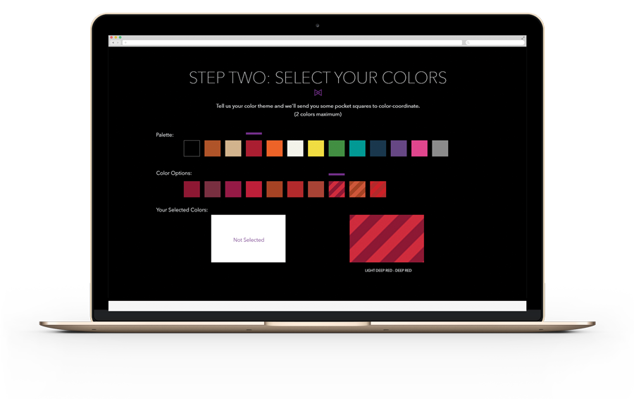
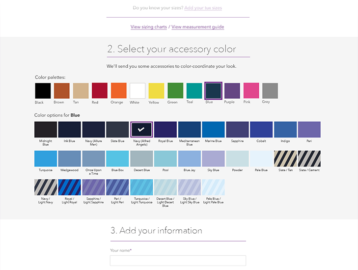
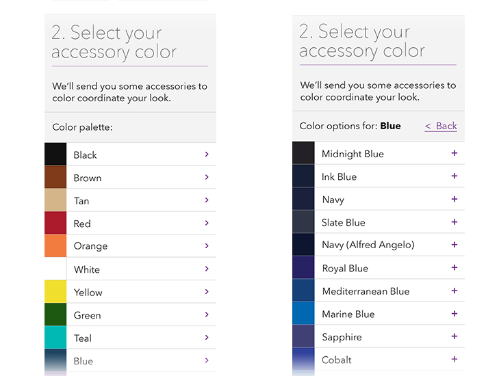
With colour selection reduced to a single option, I reworked the picker for clarity and accessibility, particularly on mobile.
Form fields were redesigned for single-column layout and better field grouping, and a postcode lookup helped reduce visual clutter.
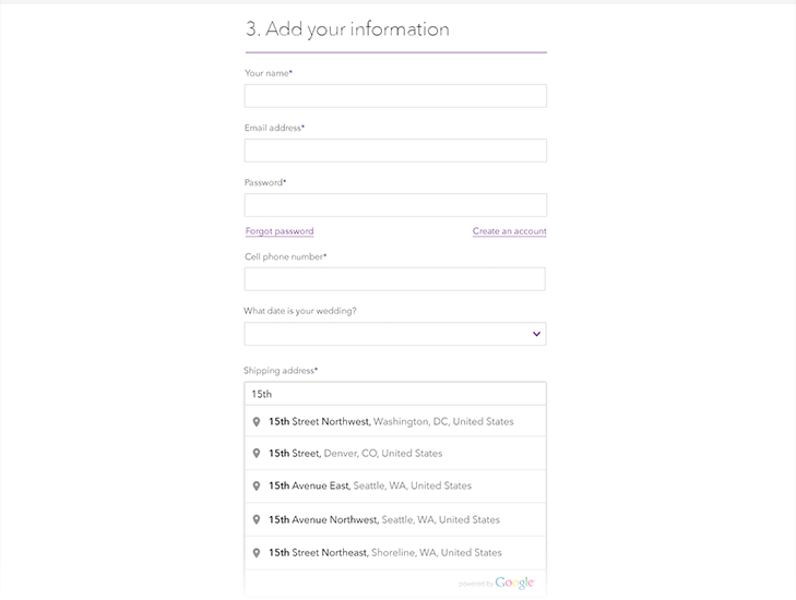
Account creation was integrated naturally into the checkout flow, rather than hidden after the main action.
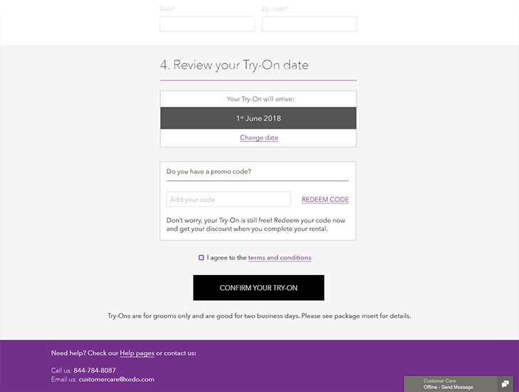
We also introduced a default try-on delivery date, placing it in its own step with a ‘Change Date’ option, helping users feel guided without losing control.
Post-launch results and learnings
The redesigned journey launched successfully. Using Google Analytics and Hotjar, we observed a notable increase in completed try-on requests and saw a reduction in earlier user issues — such as skipped measurement input — thanks to the improved layout and flow.
I supported the development team closely during implementation, pairing with developers to resolve edge cases and flesh out overlooked journeys in real time. I later applied learnings from this project to improve similar try-on and checkout flows on other ACS products.